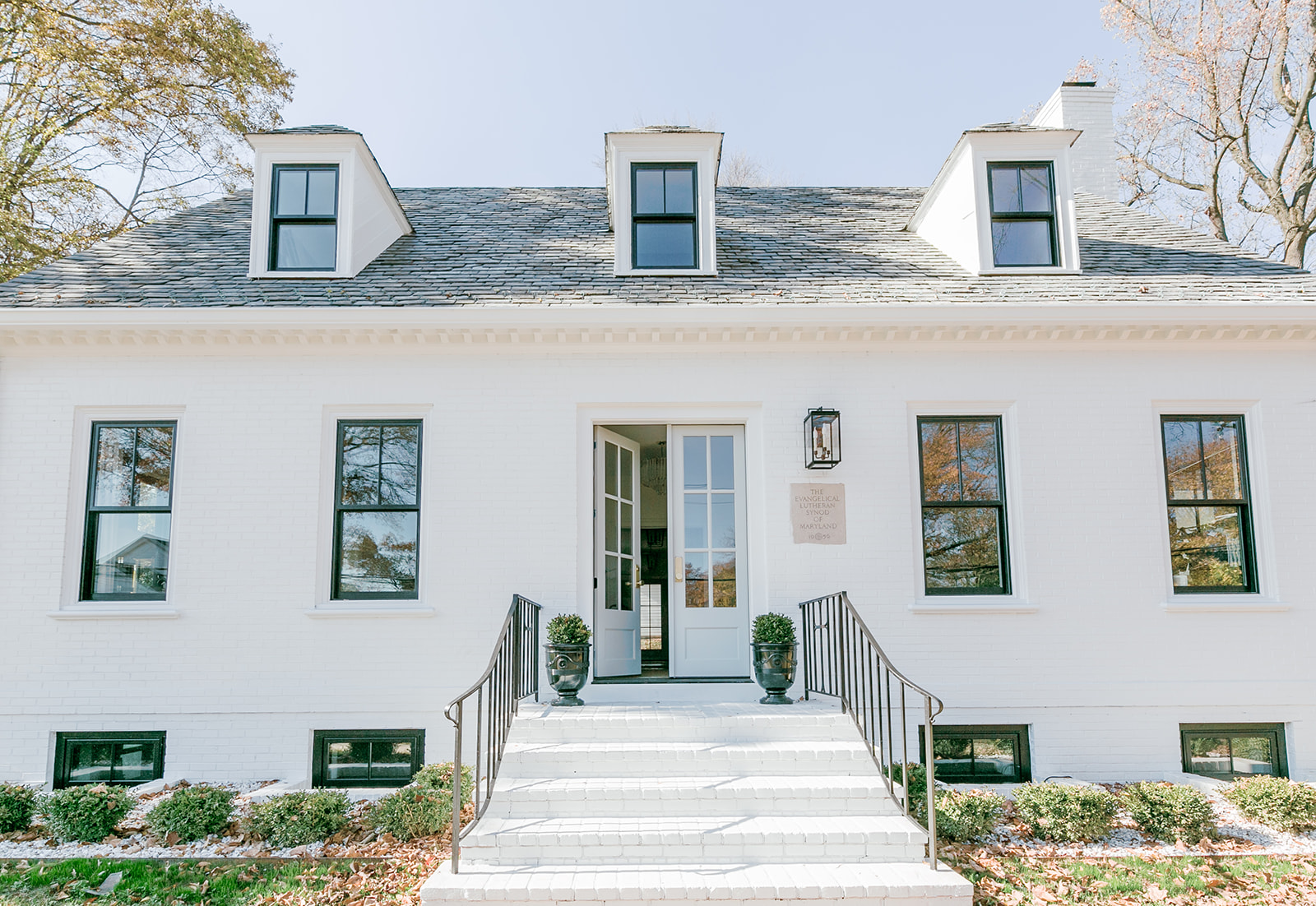
Purchasing and renovating this 1940’s brick colonial, in Towson MD, has been a true labor of love. The journey was long and fraught with a million unexpected improvements/issues and then the most unexpected of all……Covid! But with a lot of persistence we were able to turn this unloved building into the perfect home for SGI!
We started by removing a lot of the walls, and putting in headers where they were needed, this allowed us to open up the space and really see some of the amazing qualities, like the pretty moldings and 9′ ceilings. We installed new oak hardwood floors throughout (which was way better then the 1960’s commercial carpeting.) New, simple black windows and custom doors were the major changes that really brought the building to life. Once the interior was finished we moved on to the outside and painted the tired old red brick. The new white, bright color was the biggest game changer, now the building looks clean and fresh. The final piece of the puzzle was the installation of crisp landscaping.
Take a peek below at some of the Before and Afters below and let me know what you think!
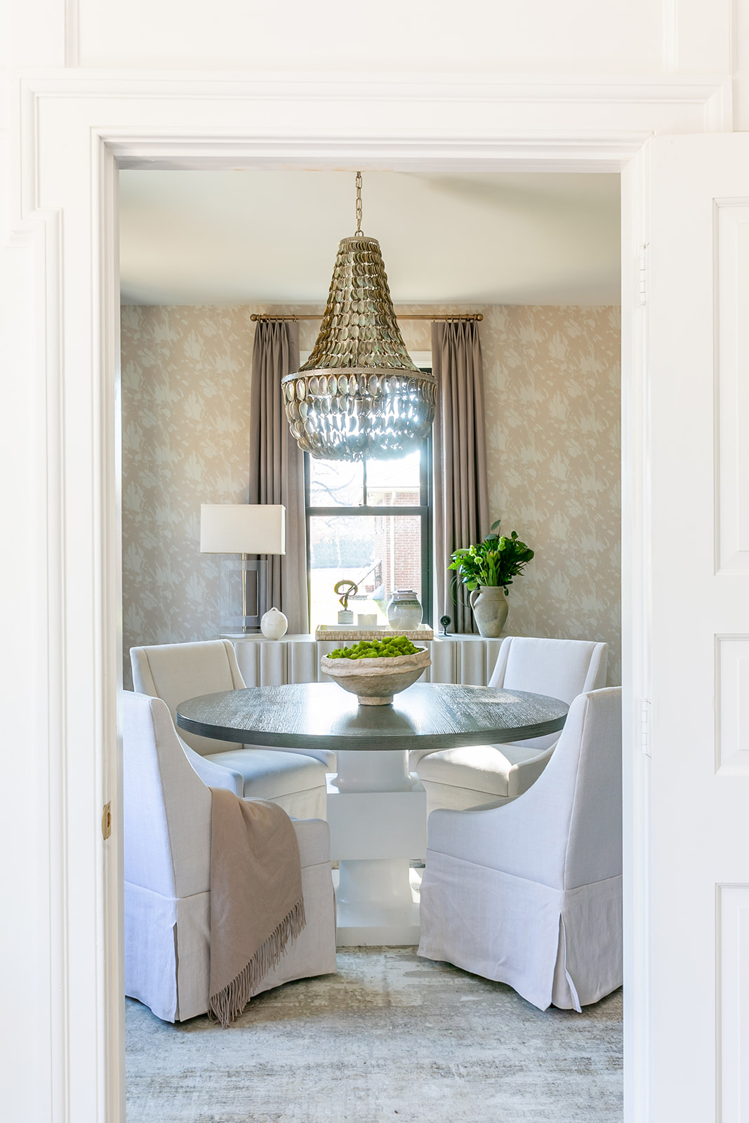 The Conference Room – probably my favorite space in the whole studio.
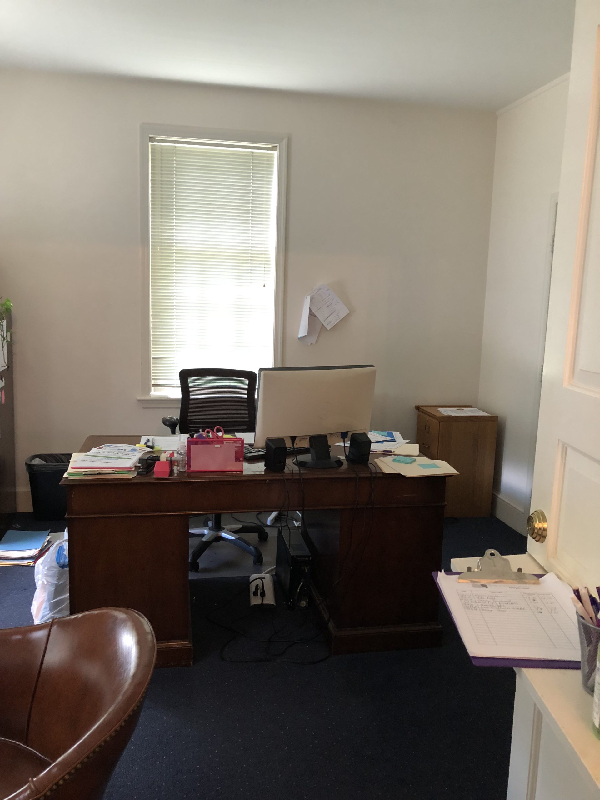 Yes, this is the BEFORE of our Conference Room, eek!
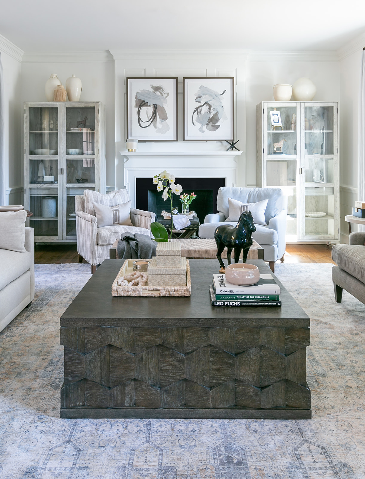
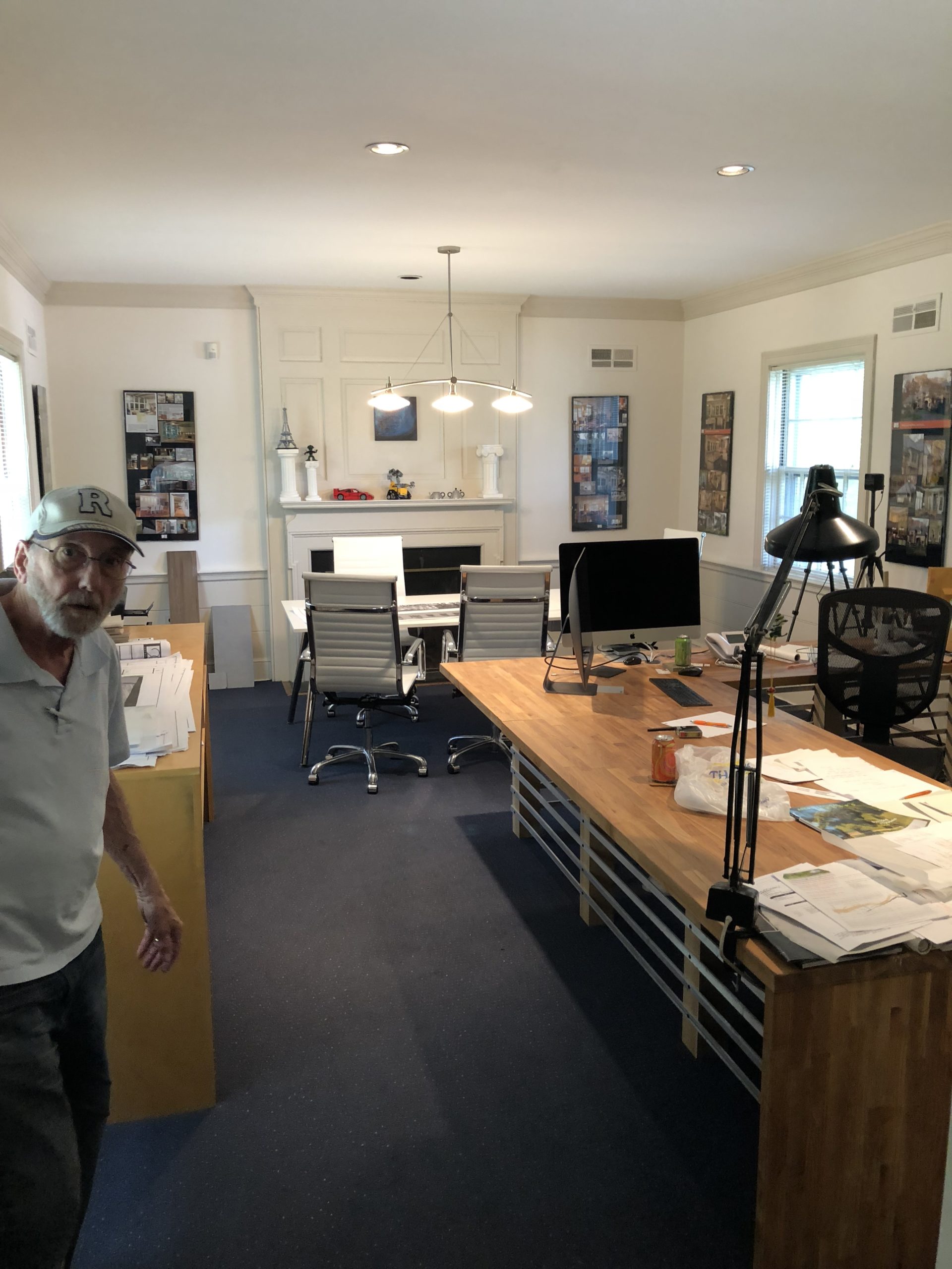 The BEFORE of our Showroom
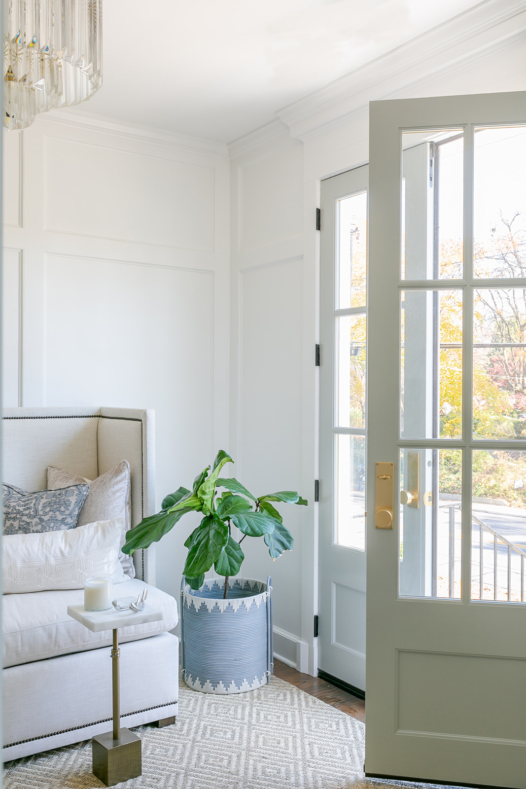
Our foyer with new custom doors and brass hardware along with paneled walls.
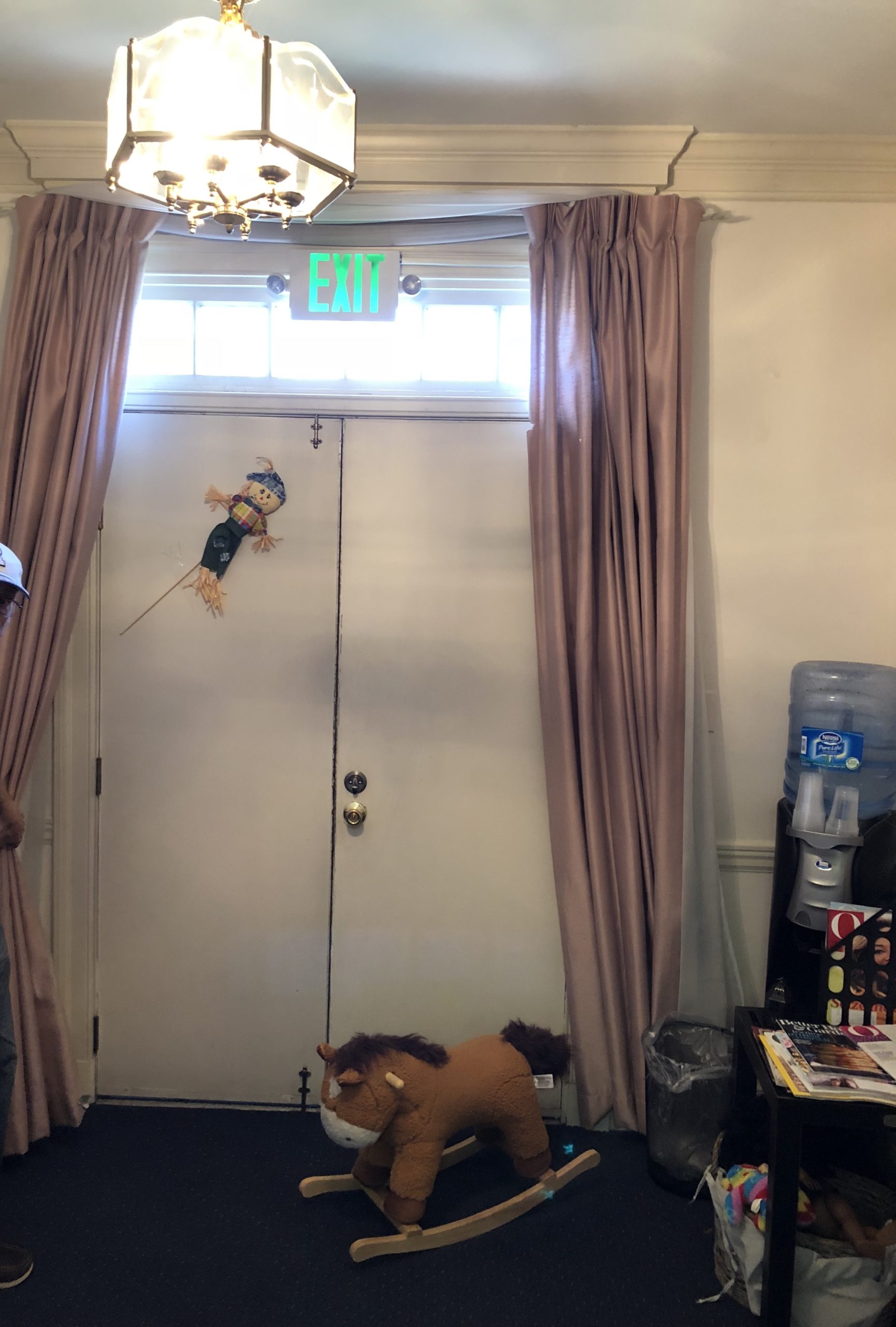 The Foyer BEFORE, can’t even believe it’s the same space.
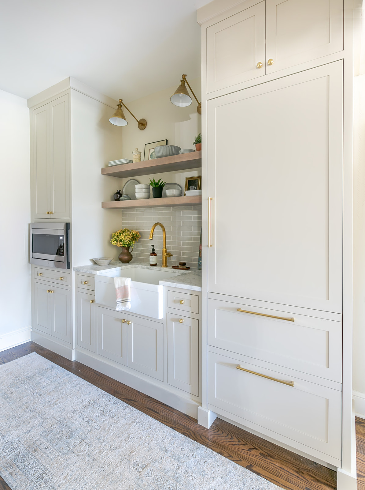 Our new kitchen with inset custom cabinetry from Rojahn Custom Cabinetry, Elkay farm sink, Newport Brass faucet and my big splurge…..the paneled SubZero fridge!
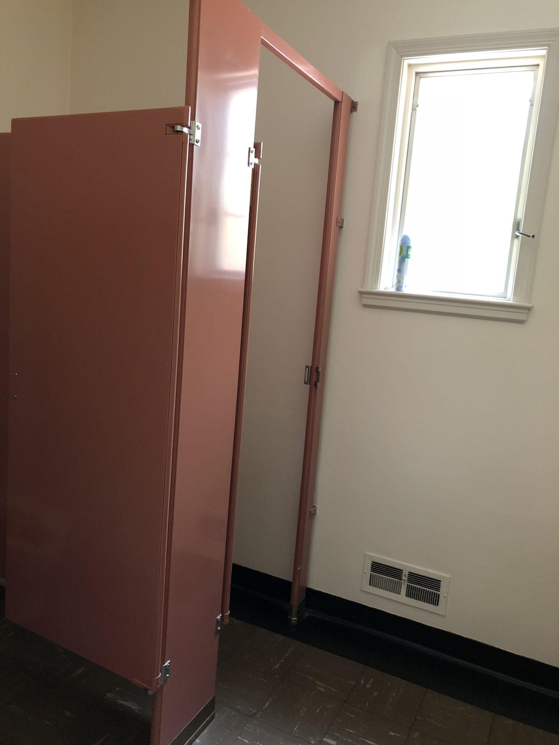 Yes, our kitchen used to be the mens room!!
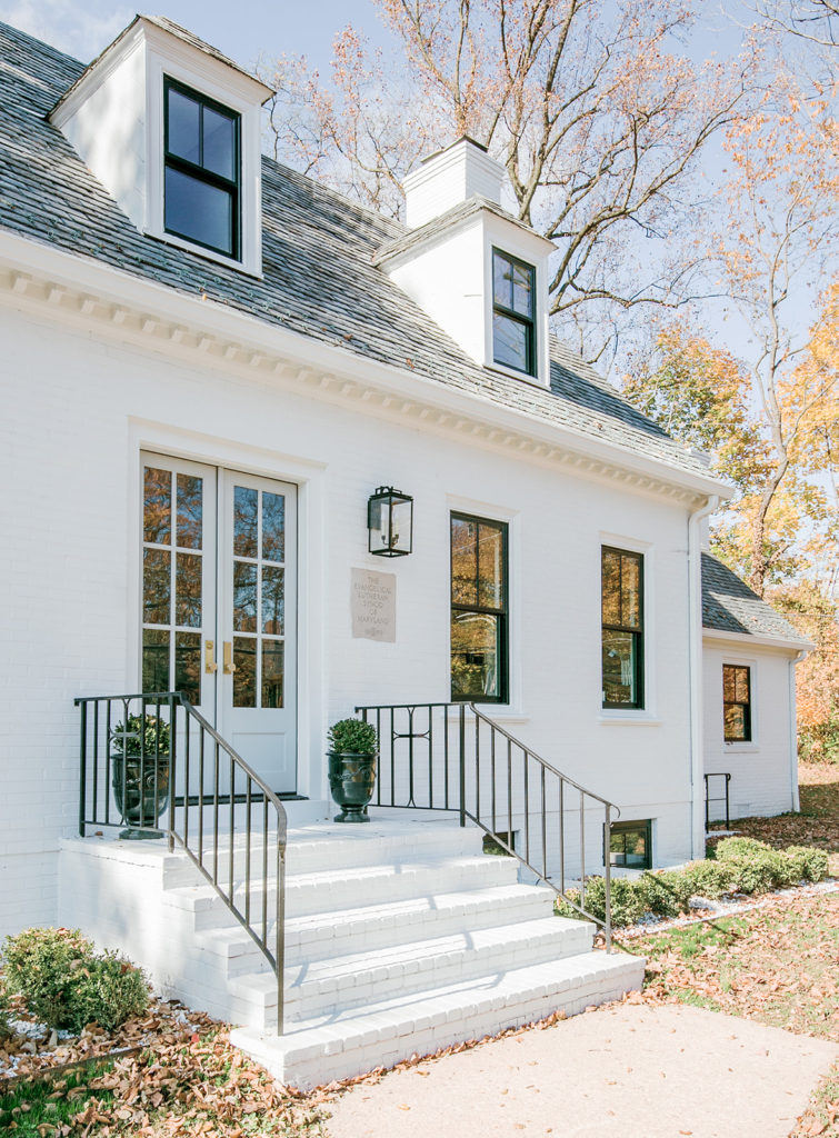 Along with a full interior remodel we also painted the red brick, added custom front doors and all new black windows.
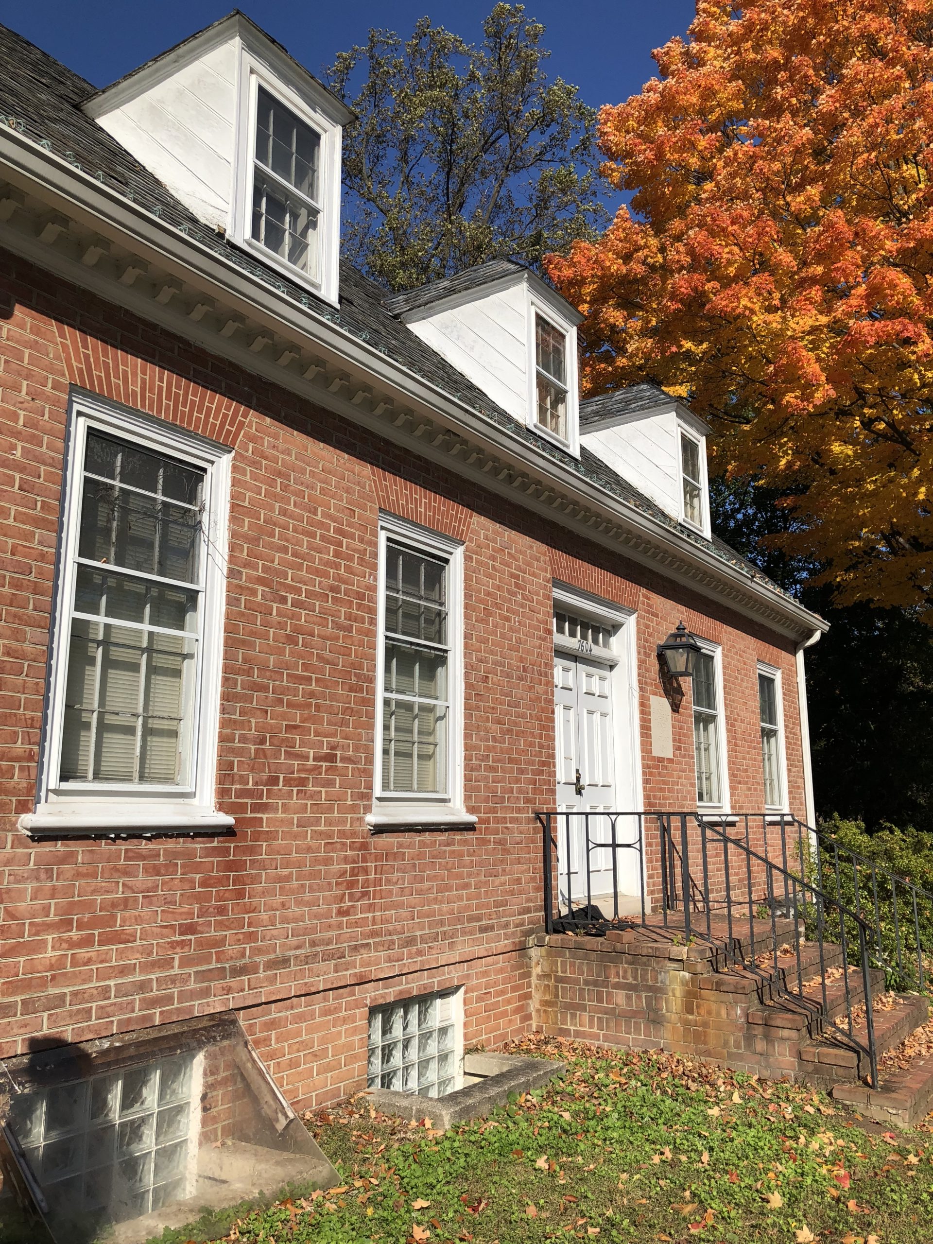 You guessed it…..the exterior BEFORE – poor building looked so tired!
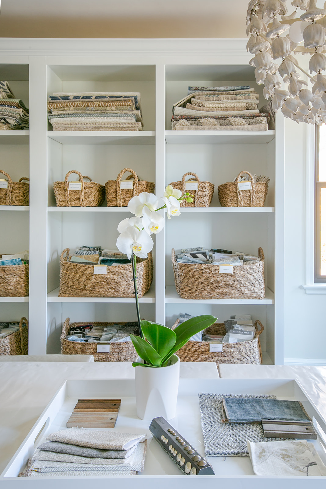
Photography: Mary Neumann Photography